Follow Lina on Twitter for more OWL fashion and fits!
The Shanghai Dragons have grown into one of the strongest Overwatch League teams within the past two years. I wanted to create a strong look for this team that has climbed up from the bottom.
I also wanted this outfit to be something that could be worn anywhere and look like streetwear, not just esports merch. I decided on a split color hoodie that I could wear oversized and a bag that went around the waist as well as over the shoulders to add a hint of techwear.
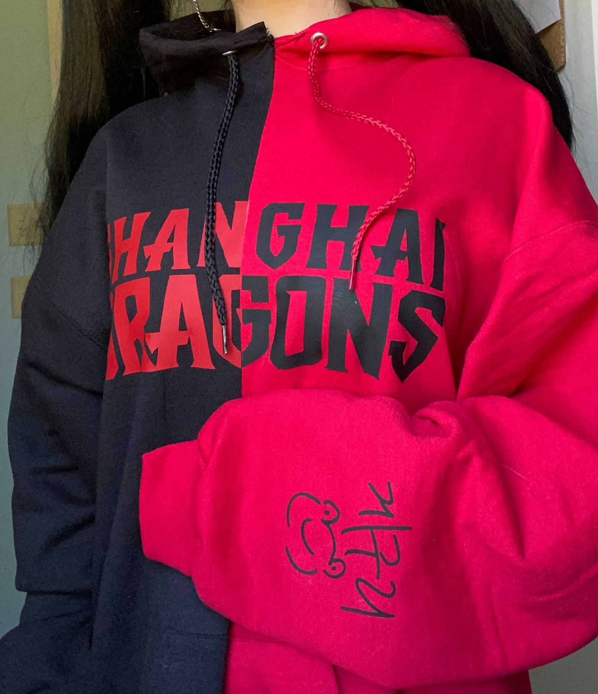
For the creation of this outfit I had to start with making a split color hoodie. I bought two separate hoodies, one black and one red, and cut them each in half. This way, I could sew them together into a half-black half-red hoodie.
Cutting up two different color hoodies and sewing them together was actually cheaper and easier to do than finding a plain split color hoodie.
After sewing the hoodie together I needed to add branding. I wanted the front logo to be bold and noticeable, however, the “Shanghai” lettering in the original logo is very small. To make the word “Shanghai” pop out more, I had to recreate the custom font used, writing it out in large letters. Then I added this logo in black on the red side and vice versa.

Keeping this idea for the back, I added the Dragons’ logo in the middle of the hoodie. The last thing I added to the hoodie was the signature, frog included, of former Shanghai Dragon’s player: Geguri. She has been the most influential player for my own esports career and I wanted to add a piece of her to the outfit made for the team she had played for. I also think her frog drawing is too cute not to have on something Overwatch League-related.
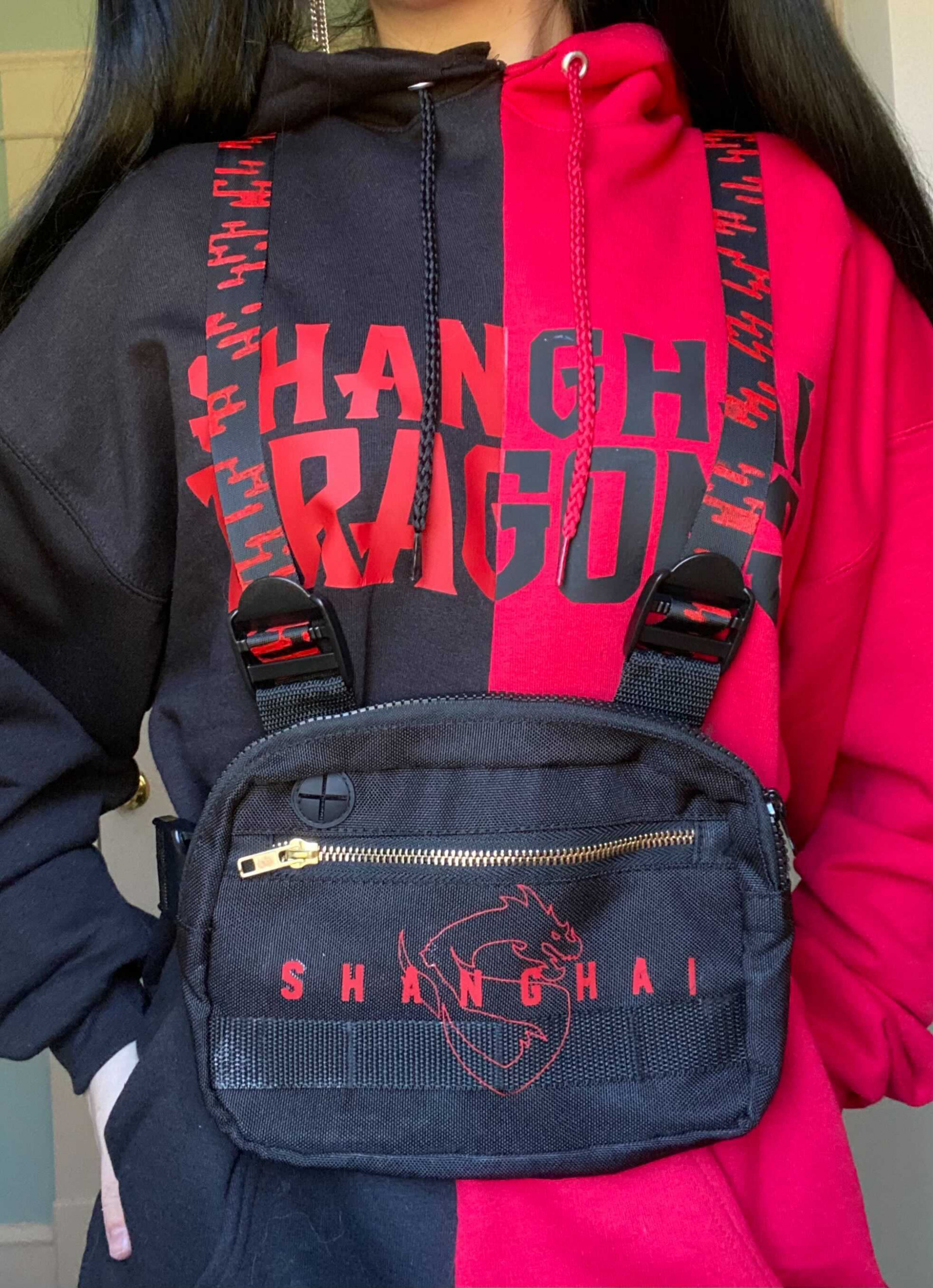
The second part of this outfit was the bag. I wanted to go in a more techwear direction for this outfit, and a full-body tactical bag was a simple way to do that. It also paired well with an oversized hoodie.
I added the team’s name across the front of the bag as well as an outline of their logo in red. I removed the top straps of the bag and replaced them with separate straps that I had painted a simplified cloud design onto. A lot of the Shanghai Dragon’s most recent videos on their social media have included cloud motifs and I wanted to tie those into the design.
I removed the team’s yellow color from this design because I wanted to create a two-tone design. I thought a red and black design would be stronger and more representative of the team’s recent branding.
I am very happy with how this outfit turned out and am hoping I can wear it to actual games this season. This outfit can be worn with and without the bag, and the bag pairs well with a Dragons’ jersey.

Sort by:
Comments :0