Where does a game's 'first impression' come from?
Naturally, the first things that come to mind are the logo representing the game's title and the key art encountered first in stores. However, once a game launches and expands into DLC, sequels, merchandise, and advertising beyond the game itself, maintaining the game's identity becomes difficult through these two elements alone.
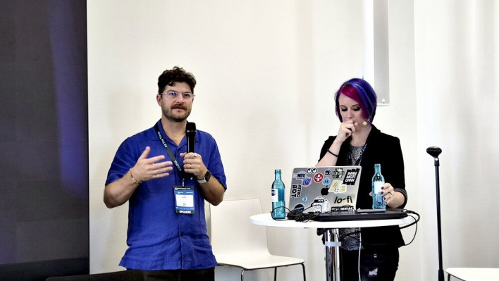
On August 24 at gamescom dev in Cologne, Germany, Matt Redway, Senior Creative Director, and Alanna Cervenak, Senior Manager of Art and Design at PlayStation Creative Arts, took the stage to explain how to build a game's brand system. The presentation was titled 'Beyond the Logo: Crafting Comprehensive Brand Systems for Games.' The official session description also framed its topic around creating brand systems based on a game's core visual elements beyond logos and key art, and expanding them across the game, marketing, and publishing.
What the two speakers emphasized was that a game's brand should be viewed as a 'system' rather than a simple logo or image. A brand is born with the game, but as the game grows, it passes through countless people and media outlets. Therefore, they explained that developers must distinguish from the start what will change and what will remain constant, creating rules so that no matter who uses it, it feels like the same game.
"You should be able to recognize the game even if you remove the title"
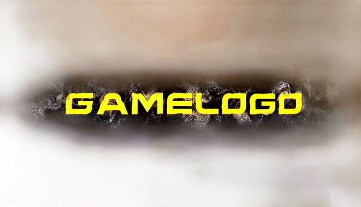
Matt Redway began the talk by showing images of several game logos with the title removed. Even with the text gone, the audience was able to guess which game it was based solely on typography, placement, and color.
The message he wanted to convey was simple. If elements such as typography, layout, color, and text styling become strong enough parts of a brand, players should be able to recognize the title even without the game's name.
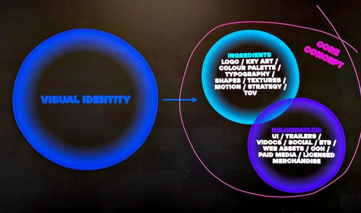
Therefore, a game's brand is not completed by logo and key art alone. Various visual elements—including typography, color palettes, shapes, and textures—come together to form a single visual identity. The elements created this way are used not only in launch campaigns but across the numerous media in which the game appears.
What matters is that all of these elements stem from a single core. Redway explained that the components forming a brand must originate from the game's core concept or unique characteristics. Even if used in different places, as long as they come from the same root, they can naturally form a single, consistent system.
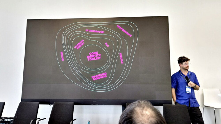
Alanna Cervenak took this a step further, emphasizing that a game brand should be designed not as a single finished product, but as a system that will continually evolve.
A game does not end with its release. DLC and seasons may be added, sequels might be made, and there is even potential for expansion into entirely different formats, such as board games. Therefore, rather than stopping at making a single logo and advertisement needed right now, developers must keep future content in mind.
Cervenak described this as a system closer to a 'rubber band' than a fixed mountain. This means keeping the core strong and clear while allowing it to bend and stretch to fit new content. Ultimately, the crucial step in creating a game brand is **deciding what to keep fixed and what to let change**.
She summarized this by stating, "Consistency gives players something recognizable, while flexibility gives them something to look forward to."
'Returnal': How a Game's Core Theme Became Its Brand
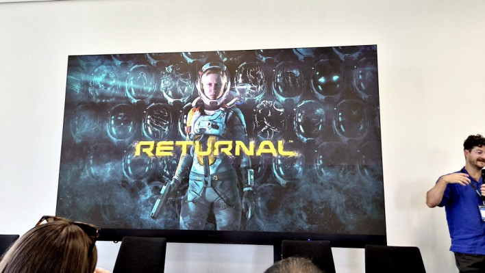
Redway introduced Housemarque's 'Returnal' as an example of this brand building.
'Returnal' is a roguelike TPS following Selene, a protagonist stranded on an alien planet, who undergoes a cycle of death and resurrection. While it is a sci-fi game featuring flashy bullet-hell combat and alien creatures, beneath the surface lies a story that blurs the boundaries between Selene's past, trauma, reality, and illusion. The gameplay loop of repeated death and rebirth is closely tied to this story.
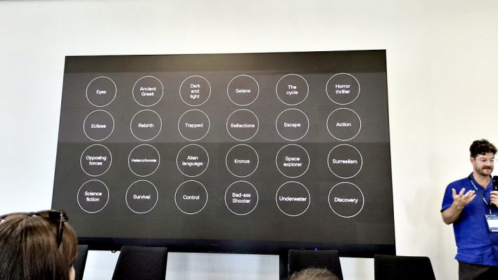
The brand design process began right here. Receiving game design documents, scripts, and concept art from the development team, the brand team analyzed the work and identified core themes to represent through the brand. Elements such as alien imagery, water, a fractured consciousness, death, and resurrection were shortlisted.
The key motif chosen for the final key art was Selene's helmet. At a glance, it conveys the sci-fi shooter genre through the protagonist wearing a spacesuit and holding a gun, but looking closely reveals numerous helmets scattered around her.
The helmets are melted by acid or shattered from heavy impact, with some bearing traces of alien life—expressing the various deaths Selene can experience in the game. The visor of the intact helmet reflects narrative elements such as car headlights and her childhood home. In essence, it was designed to deliver two layers of information in a single image: the game's genre and its deeper story.
This visual expression did not stop at key art. The crumbling, particle-like effect on the edges of the logo served as a metaphor for Selene's deteriorating mental state, and the same design language carried over into the game's UI and marketing assets.
Redway particularly emphasized the connection between game UI, branding, and marketing. Re-encountering the colors, shapes, and expressions seen in the game within advertisements and trailers maintains the feeling that these distinct deliverables all stem from the same game.
'OlliOlli World': It Must Still Look Like the Same Game Even As It Changes
When a brand created inside a game starts extending outside of it, things get even more complex.
Cervenak explained that once a game launches, the brand is used across various touchpoints—including trailers, store pages, billboards, and merchandise—and the people creating these assets are no longer limited to those who originally designed the brand.
Therefore, the standard of a good brand system is not how great it looks when crafted by the original creator. What matters is whether it provides enough tools and rules for others to make the right decisions when given the brand to use.
The game presented as an example of this was Roll7's 'OlliOlli World.'
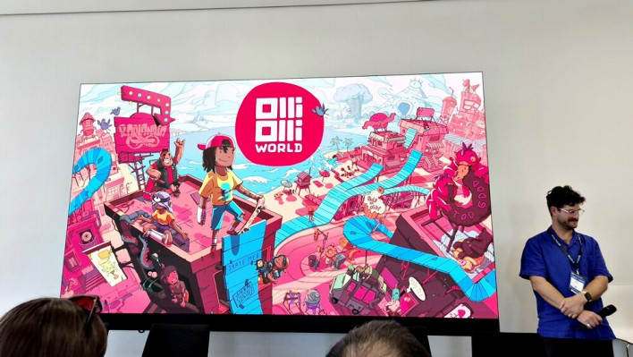
'OlliOlli World' boasts a unique visual style that combines vivid colors, soft bubbly shapes, and carefree skate culture. The development team did not leave these characteristics merely as in-game graphics, but used them as a language to construct the brand.
The rounded, soft shapes used for buildings, characters, UI, and rails within the game were brought into ad backgrounds, buttons, and speech bubbles. The goal was to evoke the feel of 'OlliOlli World' through color and shape alone, even without a logo.
This system was also utilized across different editions and DLC.
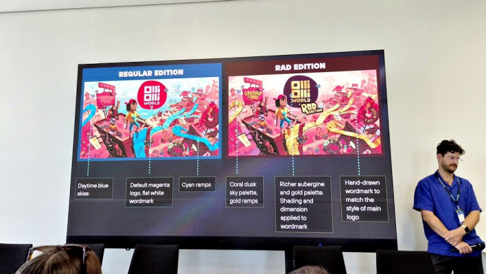
The standard edition and the 'RAD Edition' (which includes add-on content) needed to maintain the impression of being the same game while remaining instantly recognizable as distinct products on store pages. Thus, while keeping elements that make the game recognizable—such as logo shape and handwritten feel—the team altered the colors and subtitle typography.
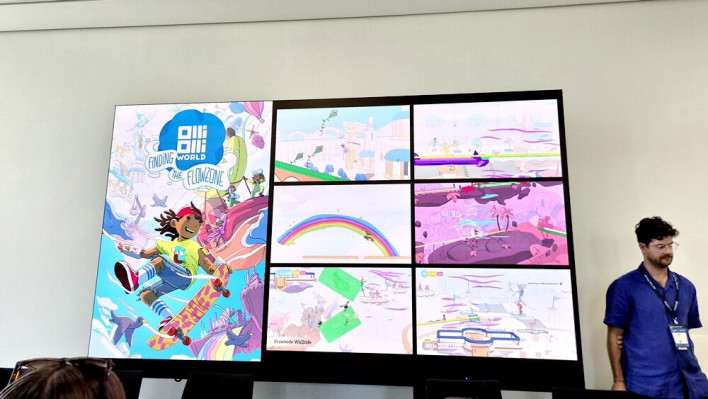
The same principle was applied to DLC. 'VOID Riders' created a mysterious, otherworldly atmosphere centered on deep purple and black, while 'Finding the Flowzone' used bright colors like white and soft blue. Though the moods differed dramatically, the fundamental shape and design language remained intact.
Regarding this, Cervenak explained, "Even if you change the mood, you don't need to change the identity."
Even Ads Can Become Part of the Game World
There are also more proactive examples of brands expanding beyond the game. Cervenak introduced Obsidian Entertainment's 'The Outer Worlds.'
The world of 'The Outer Worlds' contains numerous fictional corporations and brands satirizing corporate culture and monopolistic capitalism. These are not merely background lore, but vital elements defining the game.
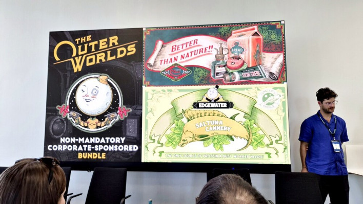
The marketing team utilized this in real-world advertising as well. Instead of the typical approach where a publisher promotes a game to players, they crafted messages as if the in-game corporations were directly advertising products to real-life players. In other words, the fictional brands within the game became the marketers promoting the game in reality.
Cervenak explained that the goal of this approach is not simply advertising the game. The objective is to extend the game's world into reality and create opportunities for players to interact with that world even outside the game.
Ultimately, elements like ads, merchandise, and events do not need to be viewed merely as promotional tools existing outside the game. If a game's identity is thoroughly established, these too can serve as additional spaces through which to communicate the game world.
"Build for recognition, design for possibility"
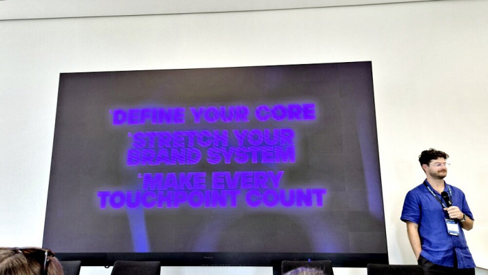
Closing out the talk, the two speakers outlined three key points to remember when building a game's brand system.
First is 'defining the core.' Not every element of a brand needs to be fixed. Instead, developers should identify which elements are core to making the game recognizable, maintain those, and leave room for the remaining elements to evolve.
Second is 'designing on the premise that the brand will expand.' It is impossible to anticipate from the beginning every DLC, sequel, advertisement, or piece of merchandise that will be created. However, developers can build a system in advance that possesses enough rules and flexibility to adapt when new situations arise.
Lastly is 'leveraging every touchpoint.' A brand does not exist solely in massive advertisements or key art. Store pages, trailers, and even the tiny achievement icons players earn in-game are all moments where the brand is experienced.
Cervenak summarized this in a single sentence:
"Build for recognition, design for possibility."
Build so it can be recognized, but design it for possibility.