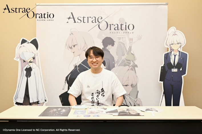
NC's new subculture RPG 'Astraea Oratio' successfully wrapped up its participation in Comic Market held in Japan. NC set up a booth featuring key visuals from 'Astraea Oratio' at Comic Market and showcased various merchandise, including a teaser artbook.
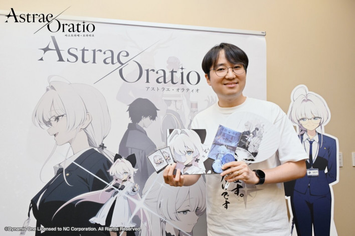
Even though the game has not yet been officially released, the artbook sold out, drawing significant attention from local subculture fans. On site, an interview was also conducted with Art Director In Kim, who oversees the art for 'Astraea Oratio'.
Please introduce yourself briefly. What role do you oversee in the development of Astraea Oratio?
“I am In Kim, the Art Director for 'Astraea Oratio'. As a concept artist, I work under the pen name 'Hwansang'. I am delighted to greet players through 'Astraea Oratio'. It is a pleasure to meet you.
Please introduce the overall art direction and core visual concept of this title.
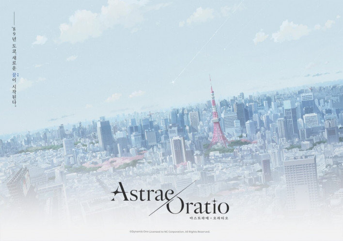
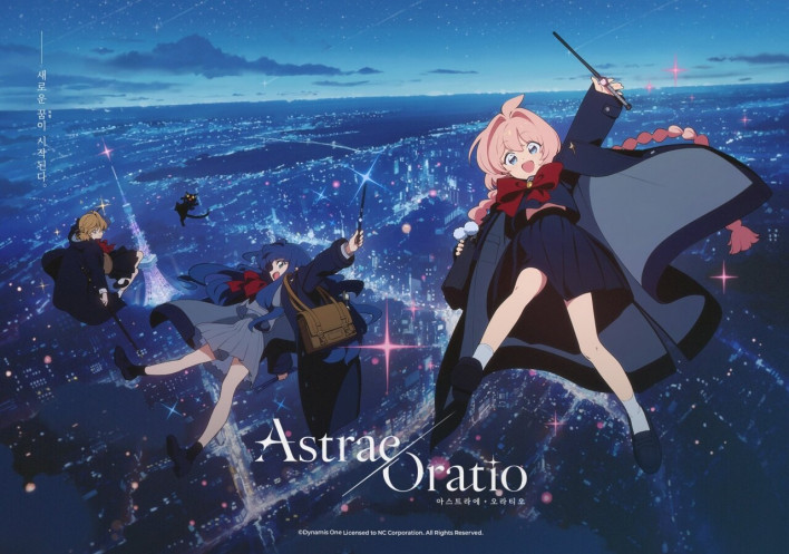
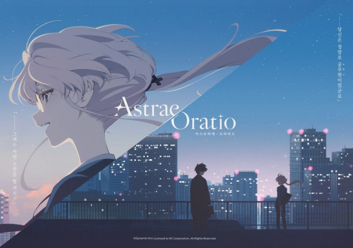
“Our visual keyword is 'lyrical analog'. With magic and shin-denki as core themes, we wanted to recreate the textures of the era when shin-denki was popular.
We put a lot of thought into presenting these well-trodden themes in a fresh and new light, but we ultimately concluded that rather than forcing artificial twists, it would be better to highlight the classic appeal of the genre. I felt that the word 'analog' best captures that classic charm.
Because I felt a strong attraction to the lyrical emotional tone in the prologue written by Scenario Director Isakusan, I combined that emotion with the texture of 'analog' to establish 'lyrical analog' as our core keyword. Specifically, our goal is to recreate 'nostalgia for an analog feel preserved as a fond memory' to match modern trends.
To achieve this, our core principle was to create a world and characters that feel genuinely real, rather than artfully staged. We operate on the belief that the world and characters are already breathing and living prior to the work itself, and we hope to convey that sensibility naturally and unadorned.
You set keywords like 'magic', 'shin-denki', and 'administration' as core themes of the game. What visual symbols do you use to express them?
“The concept of 'magic' carries a strong sense of fantasy to blend seamlessly into everyday life right from the start. So we are taking an approach where something alien is subtly mixed into ordinary everyday scenes that you see in reality, while citizens fail to notice it.
For example, an overgrown house nestled between city skyscrapers, or a character dressed as a witch standing casually in a crowd without nearby citizens taking notice—we want to start and expand the world from lighthearted moments of intrigue that make you ask, 'What's going on here?'
Personally, my perception of 'shin-denki' was strongly tied to the cold air of winter rather than summer, as well as the contrast between day and night. Therefore, we set the central color tone around blue to convey the crisp air of winter. However, to keep it from becoming overly dark, we balanced it with the pink and green of spring. To visually communicate the contrast of day and night, we are applying black-and-white contrast to graphic designs and layout divisions.
We consider 'administration' to be one of the unique charms of 'Astraea Oratio' that builds on common concepts like magic to deliver a distinctive identity. To accomplish this in the art, we are focusing on depicting maps and landmarks, which are the most direct visual elements of 'administration'.
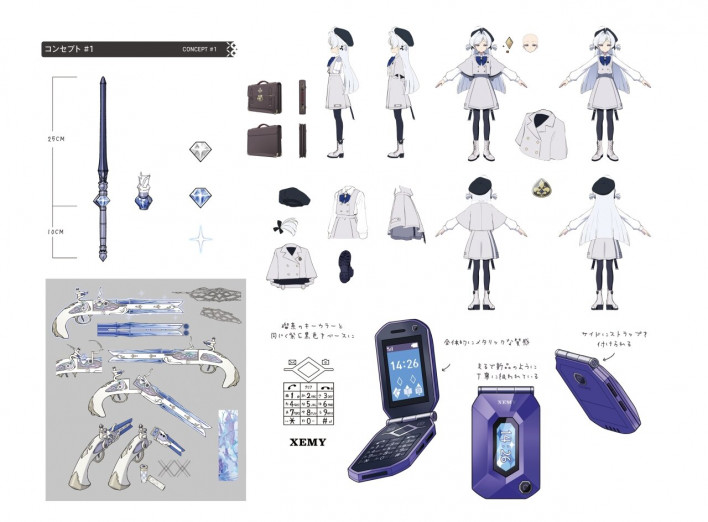
In addition, we aimed to convey the sensibility of a bureaucratic system through suits, neat paperwork, and analog props such as ID cards, official seals, desk nameplates, and business cards.
Please explain the reason behind setting the time and place as '1989 Tokyo', and how you express that setting visually.
“Since the themes are shin-denki and magic, we felt that Japan and Tokyo would naturally serve as the core stage. As for the era, we had already sufficiently explored near-future visual styles in previous projects, and there are already many titles on the market set in near-future or Western settings. So, as a fresh attempt, we wanted to explore 'nostalgia'. My fellow developers shared this same vision, which led us to establish this specific time and place as our setting.
After establishing the setting, we have been working to present visuals suited to current trends, centered around the core visual keyword 'lyrical analog' mentioned earlier.
For visuals based on real locations and monuments featured in 'Astraea Oratio'—such as Rainbow Bridge and Tokyo Tower—we are elevating the fidelity through on-site research. Our scenario and background concept art team members are working hard on this process. Personally, I have walked through Minato Ward, which serves as the central setting of the story, several times to conduct on-site research.
Compared to various projects you previously worked on, is there an art style that stands out in this title?
“In previous projects, we pursued highly characterized designs or thin, clean line art indicative of the digital era, reminiscent of anime like 'K-On!', 'Lucky Star', and 'Laid-Back Camp'. In this project, however, to fit the analog and retro setting and theme, we are aiming to express a thick, textured line art that retains a human touch from the transition period from cel animation to digital.
During development, DoReMi took charge of designing and setting the overall direction of the art style. Through discussions with colleagues such as DoReMi and feev99, who handles the background art, we were able to build the unique visual feel of 'Astraea Oratio.' We hope players will feel that 'texture' in the visuals they encounter while playing 'Astraea Oratio.'
What was the reason for deciding to participate in Comic Market even before the game's release?
“Participating in Comic Market is the first offline event for 'Astraea Oratio.' I believe it serves as a representative venue to convey what 'Astraea Oratio' pursues and how we intend to communicate going forward. In the future as well, I hope we can communicate through tangible deliverables that players can actually touch, read, and experience firsthand.
Personally, I have been visiting Comic Market regularly for a long time, and I am extremely happy to participate in Comic Market with a corporate booth for a project I am actively developing. There was a desire to share and enjoy a product influenced by Japanese otaku culture right in its birthplace, Japan.
What was the planning intent and key feature of the 'teaser artbook,' which was the main item at this Comic Market?
“Originally, the artbook was not created for public release, but rather as a guidebook for alignment among fellow developers and collaborating departments. Following the full-fledged game teasers, we felt that rather than keeping it strictly for internal development sharing, we wanted to share it with fans who are following the game with interest, which led us to prepare it as an artbook.
We hope players view this artbook like a movie program booklet. Before the narrative of 'Astraea Oratio' unfolds in earnest, our wish is that fans enjoy it as an easy way to understand the world and characters.
Finally, do you have a word for the fans who are anticipating and waiting for 'Astraea Oratio'?
“The entire development team of Astraea Oratio is putting everything into preparing the game. Before being a developer, as a fan myself, I truly believe 'Astraea Oratio' is a project full of thrilling visuals and stories. I sincerely look forward to the day when we can share the charm and joy of the game that I feel.