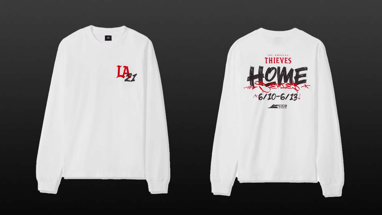
100 Thieves released their latest merch drop last week. The new t-shirt, which comes in black and white, celebrates the LA Thieves home series for the Call of Duty League — and it's not their best work.
On the front, it features a basic LA ‘21 logo. And on the back, it features a stylized graphic with the name and date of the event.
While I do like the design on the back, looking at the front without context, it looks like a design you might expect from any sports franchise in LA. And that's a not good thing because it means that it looks generic. From the front, I am not even sure it's 100 Thieves.
In this latest drop, 100 Thieves fell prey to a classic design blunder: the logo slap.
This design doesn't use any elements on the sleeves, features a basic logo on the front, and generally doesn't play with many design elements at all beyond the graphic on the back. This is a basic design.
While 100 Thieves and others talk a big game when it comes to esports fashion, some collections in esports can still end up being little more than a logo on a shirt. Esports fashion is best when it engages in the rigorous task of creating something distinct, unique, and useful that fits with the lifestyle of gamers. This means thinking beyond the logo.
Esports merch doesn’t have to look like sports merch
Sports merchandise precedes esports merchandise by a number of years so it was the first analog that many esports designers looked to when thinking about how they might design their own merch. As a result, a lot of the designs we see coming out of the esports market look pretty similar to traditional sportswear. The problem with this is that sports merch is perhaps the most basic and uninspired type of fashion design.

Whether it’s a hat for the NFL's Oakland Raiders, a sweater for the Cleveland Browns, or a t-shirt for the L.A. Angels, most sports merch remains safely in the confines of “slap a logo on it.” There are exceptions to this rule, but sports merch, in general, doesn’t stray from this formula. While this isn't all bad, it is boring.
This template might continue to work for sports given how established the “sports” look is, I don’t think that esports should follow in their footsteps.
Over the past few years, a number of esports organizations have been experimenting with fashion-forward designs that they drop in streetwear collections. These pioneering organizations have proven that esports orgs can find some serious success if they invest in high-quality apparel design.

These drops focus on creating something unique and visually distinct. Instead of slapping various articles of clothing with a logo, organizations like Team Liquid, Andbox (who own New York Subliners and New York Excelsior), and Misfits Gaming, are working toward producing lifestyle-focused, fashion-forward esports merch.

100 Thieves itself was one of the first organizations to produce streetwear esports designs, even if they fell short with this latest line. It is good to see that many esports organizations are jumping on board with streetwear collection apparel drops. Let's keep that train going!
Case Study: OWL 2020 apparel versus OWL 2021 collections
The 2020 OWL gear created by Fanatics is the epitome of the “slap a logo on it” mentality.
Many fans were unhappy with last year's jersey designs due to how simple they were in comparison to even the previous year's jerseys. The supplementary hats, hoodies, and shirts that you could buy on the OWL store weren't much better, with most pieces amounting to little more than a slightly modified logo on apparel.

The 2020 designs do not compare to the incredible merch lines coming out of organizations like NYXL, Florida Mayhem, and Dallas Fuel in 2021.
We can already see a huge improvement, in only a single year, simply by giving control back to the teams instead of attempting to standardize everything. Dallas, Florida, and New York are doing so much more with these designs than just taking their basic vector logo and printing it onto apparel, like the Overwatch League did in 2020. They are using the whole shirt, including the front, back, and even the sleeves to showcase design elements, and activating their designs in innovative ways that are more endemic to the brands themselves.
I can’t speak for everyone, since we all have different preferences, but I personally would rather spend money on a carefully thought out and executed collection of products, rather than spend money on yet another piece of apparel with the same basic logo on it and nothing more unique to the product.
We must resist the temptation to logo slap
Logo slapping is all too common, in esports and even outside esports. Hell, even streetwear brands often rely on the logo slap instead of engaging with a real collaboration. A good example of that is when Supreme did their collab with the Nike SB Gato sneakers last year and contributed little more than their font, which they allegedly lifted from artist Barabara Kruger in the first place. So really, Supreme offered nothing of their own design to that collab.
So I don’t mean to call out esports as uniquely bad since no fashion designer is immune from the allure of the basic logo slap. But I do think the pathway forward for good esports merch is to create unique designs and original fashion that can help push the industry and its revenue streams forward.
Disclaimer: The author of this article has a relationship with Andbox
-

Aaron is an esports reporter with a background in media, technology, and communication education.
Sort by:
Comments :0