League Champions Korea, the South Korean arm of the League of Legends official esports broadcast, has presented a fresh new look coming into 2021.
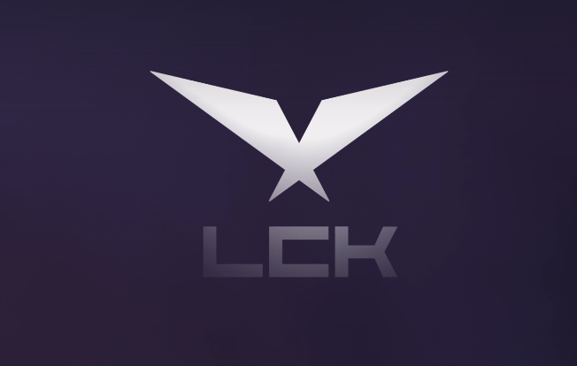
Described as confident and contemporary, the logo design simplifies the classic LCK eagle, in the form of two stylized Isosceles triangles, representing the new, without neglecting the old. A new sans serif boxy font substitutes the previous, complimenting the sharp angles of the triangles.

“It represents the past and the future, two sides of the rift - and the powerful outstretched wings of a bird in flight. Our logo pays respect to the precise angles and star-inspired geometry of our historical mark”, says the official branding note of the league.
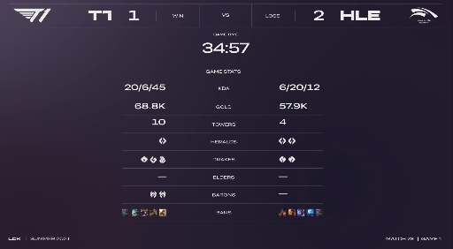
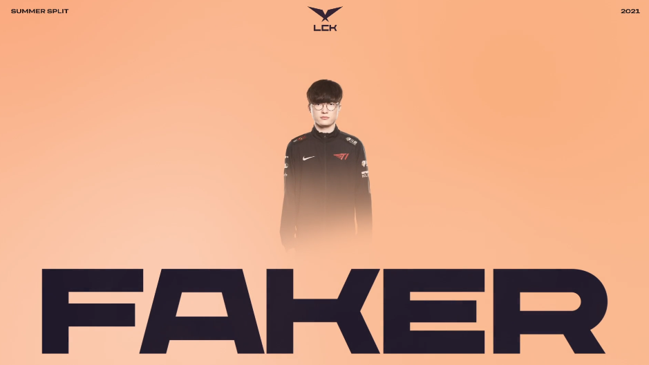
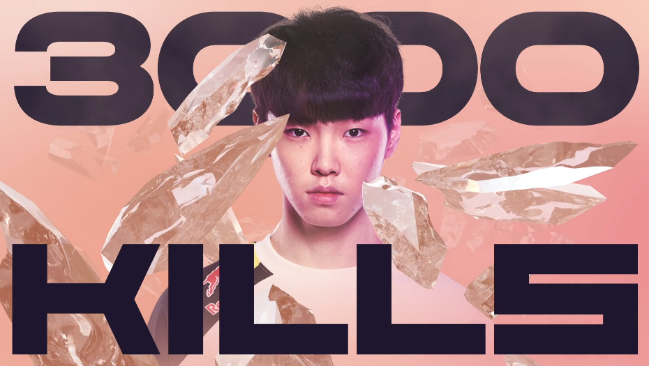
Similar to the LEC in the EU, the LCK is betting on simplified shapes and bright colors, inspired by the sky and the atmosphere, allowing players and League of Legends to be the real stars of the show. The motion graphics feature very minimalistic designs, providing the necessary statistics to the audience with no distractions.

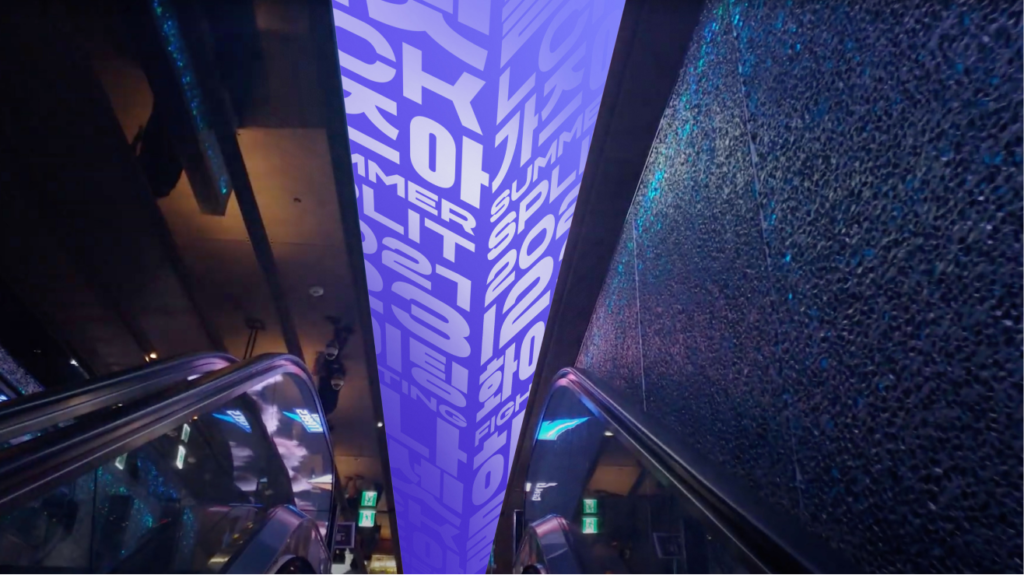
The broadcast is not the only one getting a makeover for 2021. The LCK arena, also known as LoL Park, in Seoul, will be matching the league’s aesthetic. If you are curious about more intricate design aspects, you can find them on the official brand website for the league.


Sort by:
Comments :0